


Yandex Taxi photo style

Art director
We think that ordering a design solution should be as easy as lunch in delivery. Maybe a little more complicated, but we’re sure: this process should not take weeks or months. In an effort to simplify it, we have developed our own tool: a matrix of approaches and principles that helps optimize the work on any design project.
Working on brand communications design for a large IT company, we were often faced with the fact that processes do not keep up with the discussion. New project inputs appear faster than the team is able to react and deliver a sufficient result. In communication design we work with "soft" problems. Such problems are described in quality and never have a single solution, discussions in the process can radically affect the course of the project, even roll it back to the starting point. Sometimes this circle loops and the work drags on for many months. The question was: what can we do to reduce the iteration time and optimize this process? We came up with an answer: our own framework that allows the team to defeat the "perfectionist syndrome", accelerate decision making, and focus on the creative component of the tasks at hand.
First, we had to figure out where the time was going. The main problem seemed to be deviation from the planned project trajectory: if you don't move sequentially from iteration to iteration, the work process tends to proliferate and discussions accordingly take more time. Designers and managers are under pressure, emotional blockages occur. Instead of progress, all this leads to unconscious attempts to propose variations of ideas that have been already discussed.
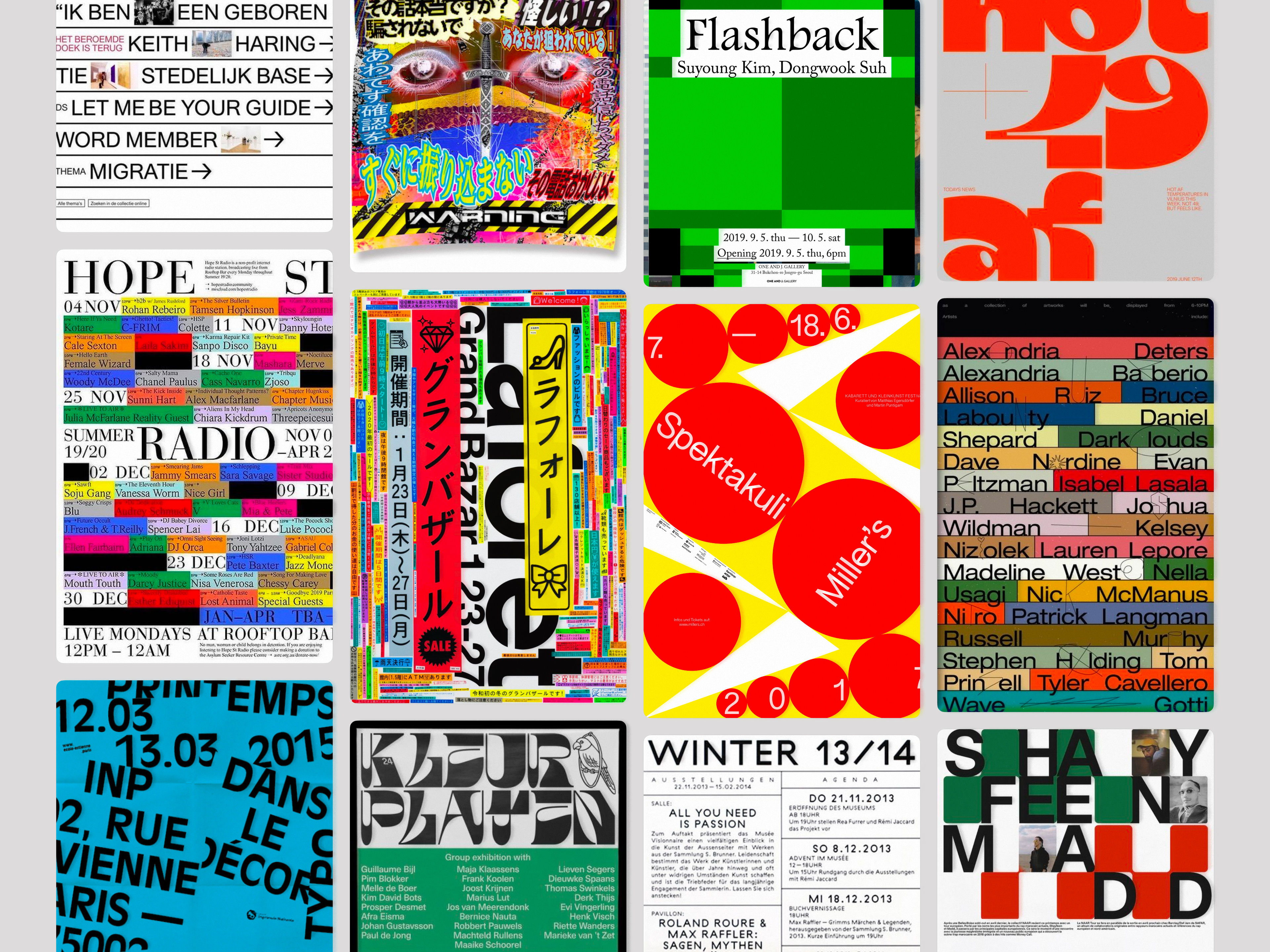
The search for new references tends to slow down: a fresh solution is not immediately visible, additional discussions at this stage are not always productive. This stage of the work also needed optimizing. Instead of starting from scratch every time, we approached the problem systematically, starting a database of references and dividing them into folders illustrating various working visual principles. Each folder contains works that share a common compositional and graphical approach. There are no "random" references, only clear examples of one particular principle and the palette of solutions possible within it.
A clear example: this principle we called "filling”. Each layout is densely packed with elements. There is no air in the composition. Even in places where we see white space, the borders of neighboring elements begin to create additional forms.
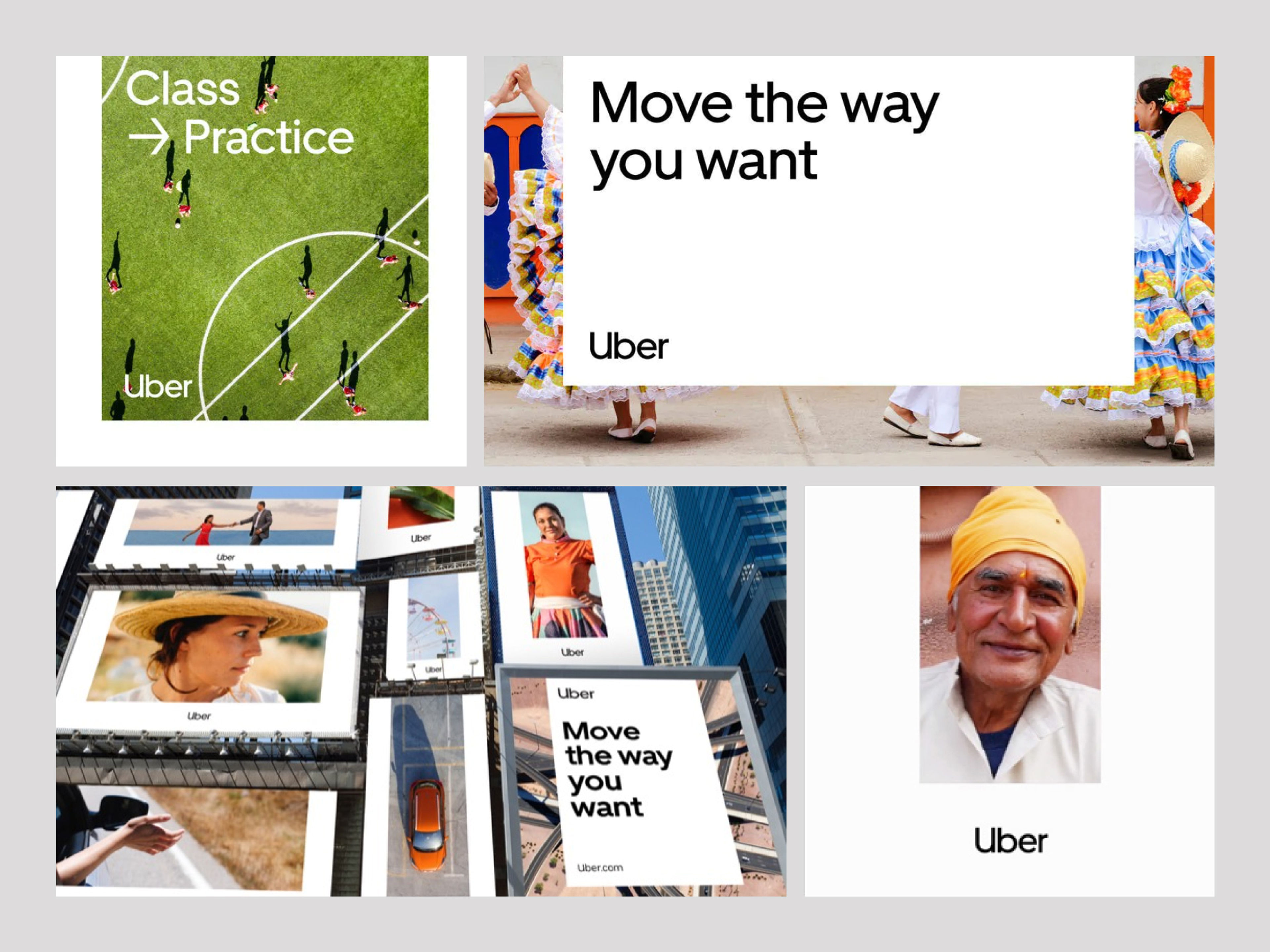
The image here showcases the "Air" principle, where the design embraces and celebrates the simplicity of blank space. Unlike the "Filling" principle, "Air" lets elements breathe, using emptiness as a tool to highlight and accentuate what's truly important.
The overall picture became clearer. Systematization simplified the process of analysis, we stopped thinking in terms of "like/dislike" and got rid of meaningless scrolling, our discussions became more focused and productive. But most importantly, this approach helped us solve the problem strategically, rather than tactically. Over time, we accumulated folders with principles that could be discussed, filtered and calibrated to suit different tasks.
This database proved itself to be a very useful tool: systematically filling up the folders we almost reduced the reference search time during the work process.
The next step was to create a convenient tool which would allow us to choose various combinations from the base of collected principles. We made a simple matrix — a table where the key cells contain the principles we chose, and crossong cells show the results we get by combining them with each other. Key cells can be filled with anything: colors, fonts, layout styles, user journeys.
The system turned out to be versatile and visual. In contrast to the brainstorming approach, where the goal is to generate as many ideas as possible and include them in the list regardless of their importance, the use of the matrix disciplines the team. Purpose comes first: you have to narrow your choices to reach the project goal, and it’s much easier to do so when you see concrete results in front of your eyes. Having such a tool to visualize possible directions made it easier for us to discuss new approaches.
Matrix can not just "give out" the right answer at random, you have to choose from the options presented. In the process of work it became clear: the more combinations and principles we want to check, the more time is spent on analyzing the results. This meant we also needed an additional system within the matrix.
We added "poles" to the table and assigned additional associations to every tprinciple. Let's say "Guide" and "Scale" are examples of dynamic composition, "Overlay" and "Filling" are examples of static composition. On the other axis, we arranged the principles from more specific to more universal ones, based on how easily each of them can be combined with others and modified. For example, "Air" and "Fill" are more universal (these are rather principles of organizing composition), while "Scale" and "Guide" are more specific (usually needed for working with components).
With the help of these additional parameters we can narrow our search depending on what exactly we are designing and which parameters are important for the task. Having calibrated the matrix, we load the necessary principles into it, discuss the results it shows, and choose a working approach. After choosing it, we move on to the second stage.
The second stage is individual work on the selected approach to prove its efficiency. Each team member should assemble several sketches whithin the approach chosen after reviewing the results of the comparison with the matrix.
The working group then looks at all the sketches together to select the most promising options. If no one in the team accumulates a significant number of successful designs, it’s necessary to take a step back and recalibrate the approach.
For productive work, it is vital that each team member is introduced to the base of references and understands their meaning. The approaches should not be discussed or changed during the working process. Sketches are produced strictly within the framework of the chosen approach, each stage of the work is clearly limited in time. If sufficient results are not present and the team feels the need to step back, they can only go back one stage.
After selecting successfull sketches the work goes to the final stage - finishing the process within the chosen direction, choosing colors and fonts. At this point returning to previous stages is impossible.
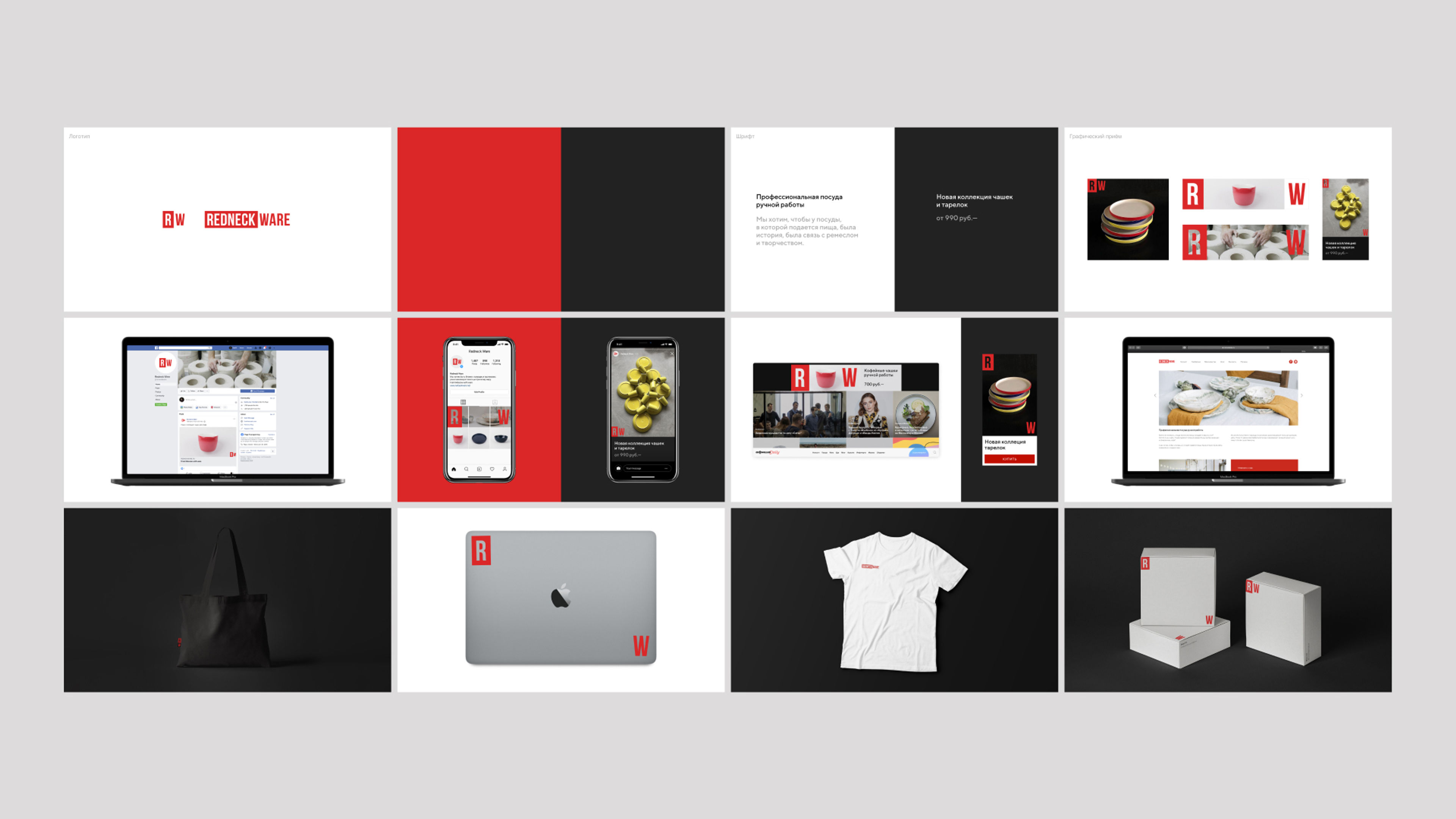
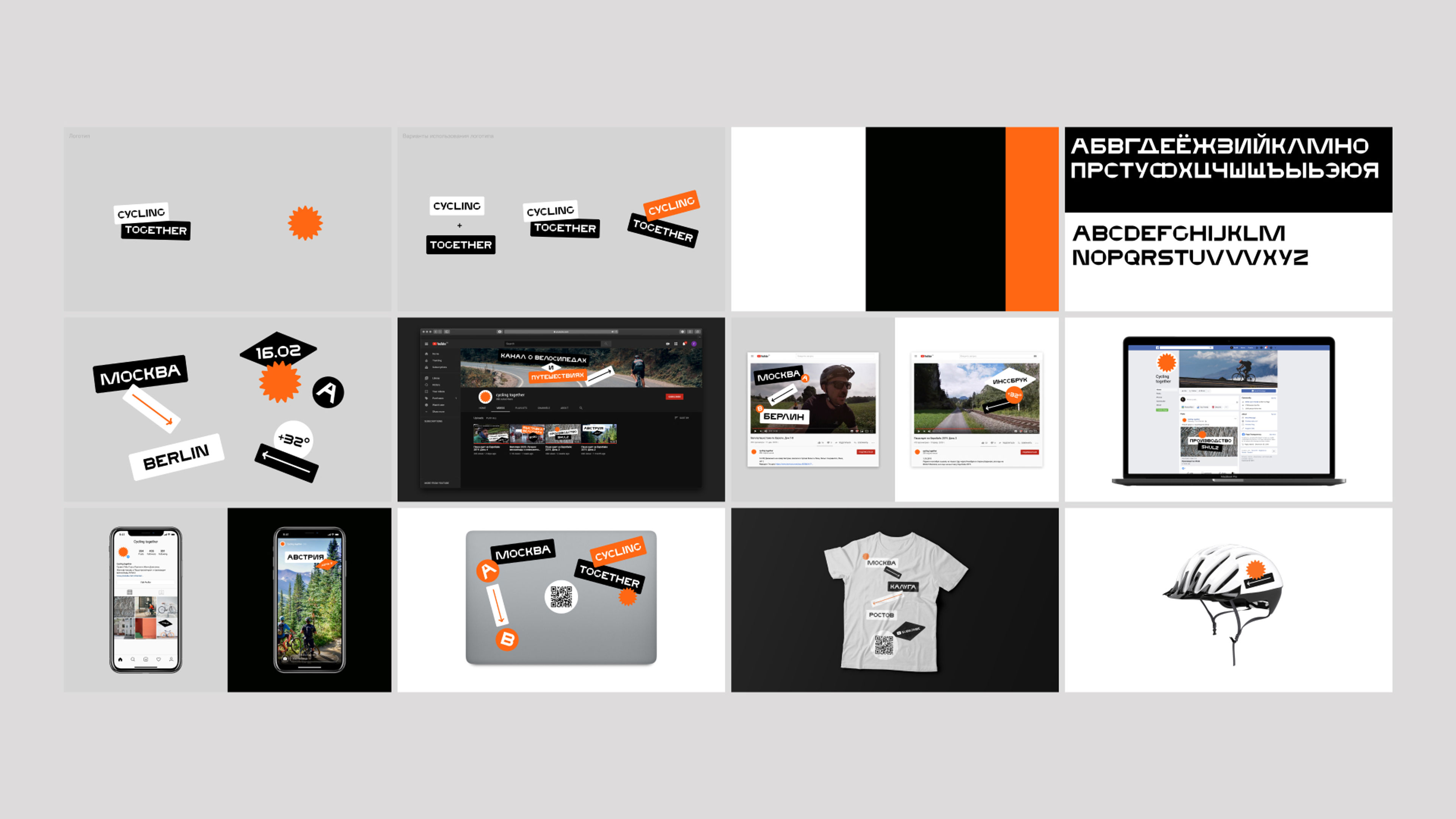
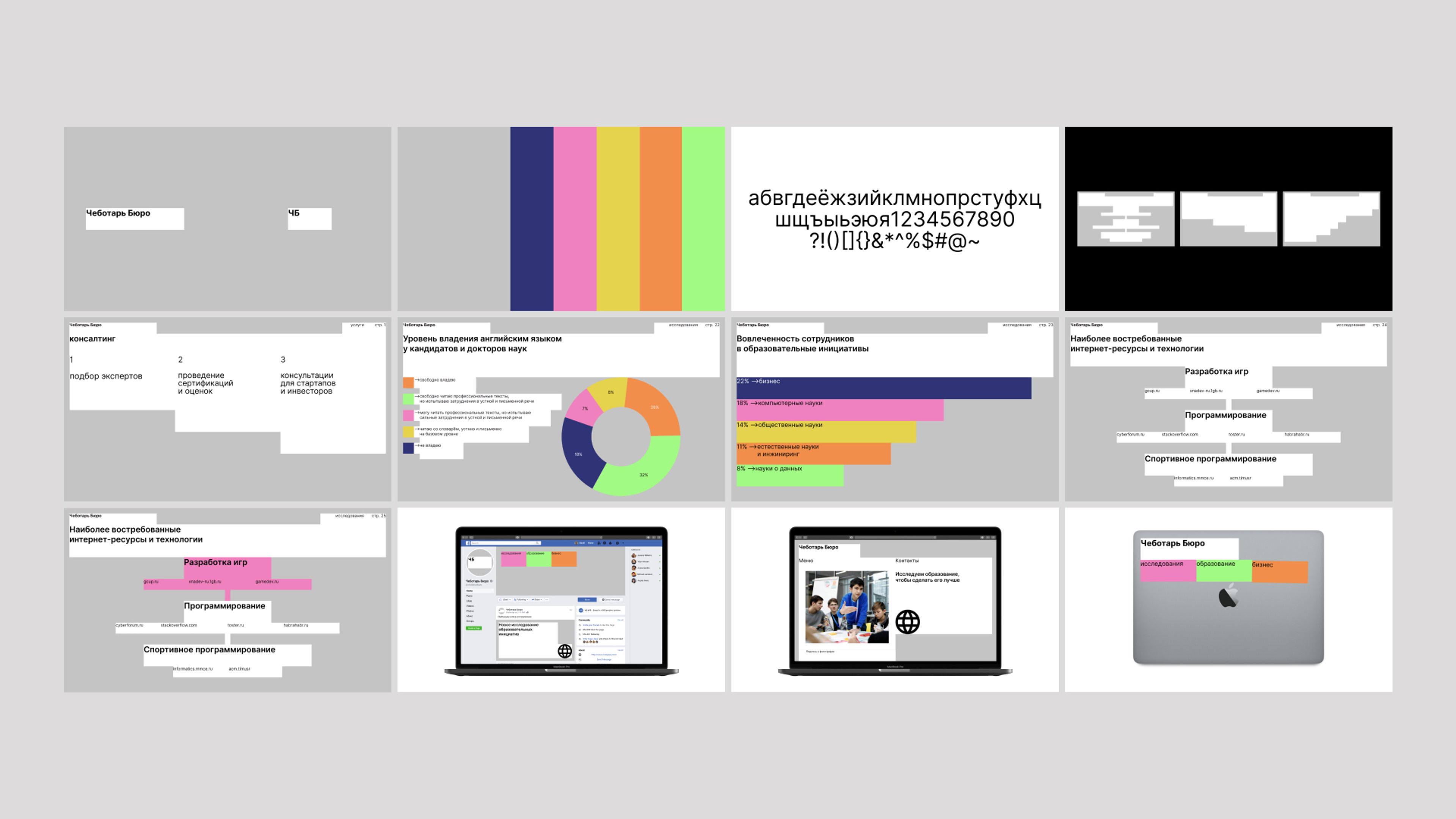
Working with brand identity is the most common task for us, so we decided to use this direction to try out our method. We believe that a good brand identity should be practical. First of all, it’s a way to organize layouts into a system, to make it recognizable and easily reproducible. And the less time it takes to achieve that goal, the better. In this paradigm, the logo becomes less important, and major design principle becomes the main tool. Universal principle builds up well to any medium, from outdoor advertising to banners on the Internet.
Uber is the most vivid example. A characteristic U-Frame principle allows you to make any layout recognizable even without a logo.
by Wolff Olins
Vevo is also a good example. It’s easy to structure any layout in a distinctive style using Graphic blocks principle.
by PORTO ROCHA
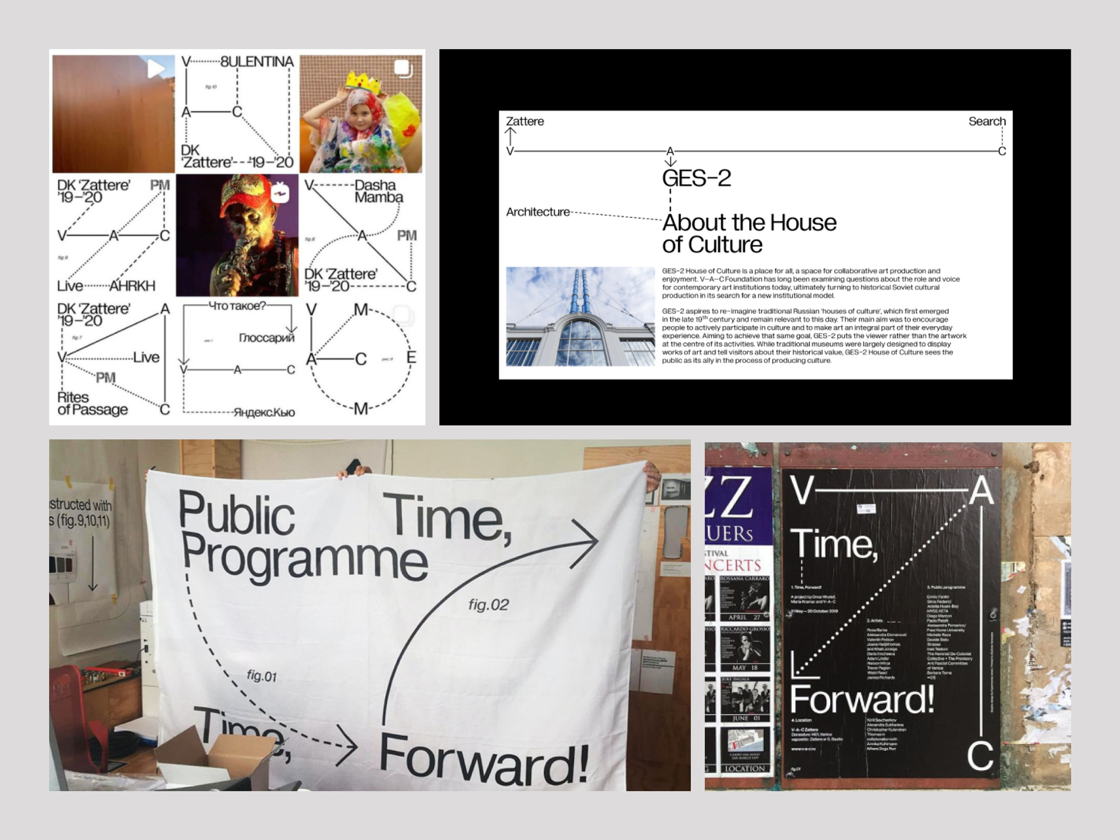
V-A-C. Identity is based on the use of guiding lines. A less universal principle, however, also becomes a bright overall visual dominant.
by Experimental Jetset
We chose small businesses as our test group. First, these are the clients who most often need an identity to launch a new product or service. Secondly, they usually have very practical requirements for the design: it should be easy to reproduce and deploy for different communication channels. Thirdly, at this stage businesses often test different hypotheses, so speed is more important than quality.
Here’s a package of services we offered:
According to the terms of the test, our branding had to be ready for use right away. For example, all layouts and mockups should be easy to edit, all fonts should be free. The tools we used for each case were a matrix of 8 graphic tprinciples, a color library, and a font library.
To start the work, the client fills in a form, where he indicates the formal data about the company, chooses 3 characteristics of his brand and writes in free form all that he thinks is necessary to tell about it. Filling the form should be fast and easy. It’s an overall approach to the work process: each stage should be clear and quick.
Here are the brand characteristics we asked our clients to comment on, so we could calibrate the matrix “poles” according to their answers:
Customers:
Our system successfully passed the first test. We fully automated the process of assembling the presentation, all layouts and mockups. For each case - exactly 4 working hours of a two-people team and a stable result, which can be finalized if desired.
Clients
A sample of 6 projects proved the system’s efficiency. Clients did not always like the final product based on the results of one work cycle, but the matrix worked exactly as it was intended. During the tests we studied our own tool better: learned to be more precise choosing the principles, practiced and began to use the matrix regularly to solve our work tasks. The main conclusion for us was that the type of content should be the defining criteria on the stage of choosing the working principles from the matrix.
All the test cases we did for free, in exchange for detailed feedback. We were interested not so much in the satisfaction with the final result (it varied: as a rule, the more personal attitude the client had towards his or her business, the lower was the satisfaction), as in the expectations from the service: how quickly, how convenient and easy it was to work. By these parameters, all our clients were satisfied.
Matrix is a versatile tool that allows you to deal with meaning instead of design, to approach the work in a more organized way, to structure iterations and discussion at any stage. We think it will be useful to everyone: freelancers, in-house studios, agencies. The person who is going to work with the matrix has to compose it himself, adjust it to certain tasks in the process. This is not a ready-made template, but a variable system that helps to minimize routine.
The artificial constraints embedded in our framework simplify and structure the work process. You can't invent anything radically new with them, but they free up your head and hands for really important tasks. Such as, for example, visionary and creative discoveries. Make design innovative again.